This guide will give you the easiest ways to generate a vintage look in Lightroom.
I’ve been using Adobe Lightroom for many years and often need to add a vintage look to photos.
Using the Lightroom effects panel will give you the necessary effects to make a convincing and compelling vintage look.
Let’s dive into the tutorial.
HIGHLY RECOMMENDED
Popular course reveals the simple tricks to getting incredible results with Lightroom in record time.
Give Your Photos The Look They Deserve!
How to Generate a Vintage Photo Look in Lightroom
If you have a nostalgia for times long gone and reminisce about what life was like, why not add a vintage look to your photos?
Replicating a vintage look is one way to step back in time and relive these fascinating times.
Using Lightroom software, you will have all the necessary tools to create a captivating and realistic vintage look.
A vintage-look photo needs to capture the era’s fashion and essence, as well as replicate its photographic techniques.
Vintage photos were taken with an analogue camera using 35mm film and later developed in a darkroom.
Noise, bordering and color palette are some of the factors that help to emulate a vintage look.
The nostalgic, old-school look is used by contemporary photographers and artists to create intriguing art.
Using Lightroom, you can do the same and make unique themed vintage photos to share with family and friends or for your clients.
So, why don’t we give it a shot?
Step 1 – Select a Photo
The first and possibly most important rule is to select a photo where the fashion is consistent with the decade you aim to recreate.
To emulate a vintage look in Lightroom, we need to delve into the past and explore this era’s unique fashion and style.
If you’re stuck for vintage-style ideas, check out some old-time movies. You’ll notice that the fashion and the way people pose and talk are completely different from how we act today.
Some important tips when selecting photos to use are to avoid including recent technology, especially smartphones (unless this is a quirky feature you wish to highlight).
If it’s the 19th century, remember these subjects had to hold a position for two minutes.
Although the effects panel will give you all the tools you need to emulate a vintage look, it isn’t all you need. Creativity and a savvy eye are worth their weight in gold.
Step 2 – Add the Sepia Tone
Once you have selected a photo, you can start creating a vintage vibe. One way to do this is to add a sepia tone to your photo.
Sepia-toned photos were common up until the 1920s, so make sure the theme of your photo is in line with the fashion that predated the ’20s.
Contrary to popular opinion, the Sepia tone wasn’t a result of the photograph ageing.
Quite the opposite, it was due to the use of a chemical, sulphuric sepia, which was used to increase photo longevity. And last they have! Many sepia photos are still in prime condition.
The slightly reddish, brown and yellow sepia colors give these classic photos a gentle, subtle warmth.
So, how are we going to recreate it? Open your image in Lightroom’s Develop mode.
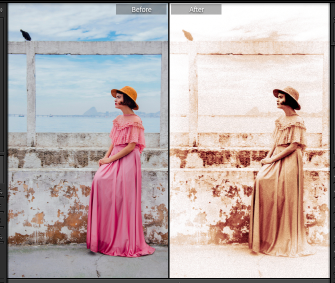
I’ve chosen an image in which the woman is wearing a dress and hat that wouldn’t look out of place in the 1920s.
The backdrop is neutral and could either be taken today or many decades ago.
I also like the balance the blackbird adds to the composition, drawing the attention away from the lady’s jet-black hair.

The sepia look is a monochrome look, so first, we have to reduce the color palette by changing the image to black and white.
Head to the top right of your workspace and click on the triangle beside Basic to open the Basic editing panel.
You will notice the following at the top of the panel: Profile: Color.
Click on Color, and a drop-down menu will appear. From here, select Monochrome.

The image will snap to a black-and-white version. You might be happy with the contrast, but if not, you can adjust the greyscale using the Basic sliders.

The Basic sliders are Exposure, Contrast, Highlights, Shadows, Blacks or Whites. Slide the sliders to the left to decrease the effect or to the right to increase it.
There are too many mid-tones for my liking, so to create the desired contrast, I have decreased the Blacks and increased the Whites.

The next step is to add the sepia tone. To do this, open the Color Grading panel by clicking the arrow beside Color Grading.
The panel will drop open, and you will see five icon options at the top. Click on the first circle icon to adjust the hues of the image’s shadows.
To add the sepia tone, click inside the large multicolored circle and drag the mini circle into the hue we are looking for. The sepia hue lies between yellow and red.

To fine-tune the sepia tone, click on the next two circle icons. This will adjust the Midtones and Highlights hue.
For both the Midtone and Highlights, drag the circle pointer in the multicolored circle into the area between yellow and red.
As you can see below, the image now has a sepia tone.

If you look at old-time photos taken before the 1920s, you will notice that the vintage sepia tone has a broad range.
It hovers loosely between the red and yellow tones; sometimes, its saturation is higher, sometimes slightly faded.
This is because the color and saturation of the sepia effect depended on the quality and strength of the sulphuric sepia used by the photographer in the darkroom. How long the photo was seeped in the chemical also affected the hue.
The image above is slightly too rich in red for my liking. To tone it down, I have increased the yellow in the midtones.

You can play with the Color Grading panel until you achieve your desired sepia tone.
In the image below, I have achieved the exact vintage sepia tone required. However, the image now appears too high in contrast, which causes a loss of the photo’s finer details.

Open the Basic panel and adjust the sliders under Tone to alter the photo’s highlights and contrast.
In the image below, I have increased the Contrast, Highlights and Shadows while increasing the Blacks from -88 to -52.

Now, the image has a more subdued and subtle sepia tone, and the textural details are more pronounced.
This photo now has a vintage appeal and looks almost like it could have been shot in the 1920s.
Step 3 – Add a Vignette Effect
A vignette border is reminiscent of an age long gone when photos had faded black or white edges.
Although the vignette creates an attractive frame for the subject, it was not originally created intentionally.
Originally, it was a result of the eighteenth-century camera and lens design.
The earliest lenses could not evenly distribute light completely across the entire photo frame, meaning the furthest corners could not be exposed, resulting in dark or black edges.
Later, this lens defect was embraced by photographers as a way to focus the viewer’s eye on the subject.
When the cameras no longer produced a vignette effect, photographers recreated it using darkroom techniques.
To add the vignette effect in Lightroom, we head to the Develop panel.
Open the Effects panel by clicking the arrow beside Effects; once clicked, the Effects panel will drop open.
The Post-Crop Vignetting sliders are located in the Effects panel’s top section.
Use the first slider, the Amount slider, to change the transparency and color of the vignette effect.
Slide it completely to the left to make the vignette completely black, to the right to make it white, or in between to make it partially transparent.
In the image below, the Amount slider is partially but not completely to the left to create a semi-transparent dark border.

To alter the width of the border, move the Midpoint slider. When moved to the left, it becomes wider; when moved to the right, it becomes thinner.
The Roundness slider alters the shape of the Vignette border. Move it to the right for a circular shape or to the left for a rectangular shape.

The Feathering slider adjusts the vignette’s feather.
If you want a sharp, straight-edged border, move the slider to the right. If you want it transparent border, move it to the left.

The effect I am looking for is a soft, semi-transparent white vignette.
Although the original vintage vignette effect caused by the first photography lenses was dark, the one intentionally created by photographers in the darkroom was white.
Therefore, you can use a white or black border and still be on track to create a realistic vintage photo effect.
The artistic choice is yours!
Step 3 – Amp up the Noise and Grain
Adding noise or grain to a photo in the right quantity can help add to the authentic vintage look.
But be careful not to overload the image with large floating particles; this could result in your image looking grungy rather than vintage.
Grain in olden photos was due to the small particles of metallic silver in photographic film.
Adding noise to create a grainy look is easy using Lightroom; head to the Effects panel.
Under the Post-Crop Vignetting section, we find the Grain section.
Here, there are three sliders: Grain, Amount and Roughness.
Before we adjust the sliders, zoom into your image so you can see the finer grain details. You don’t want to remove any important fine detail from your photo.
To zoom in, head to the Navigator panel at the top left of your canvas workspace.

Click on the arrows beside the percentage value and select 12% or 25%.
Click on the navigator preview box and move the preview window to reposition the viewing window if needed.
We will create decent-sized grains reminiscent of vintage photos and obvious to the viewer’s eye.
To do this, slide the Amount, Size and Roughness sliders in slight increments to the right.

As you can see in the image above, the grain size has been adjusted to generate a realistic photography grain look.
To create a vintage look, you don’t need to add noise, as many vintage photos were shot in perfect focus.
Adding grain is an optional creative choice, and it’s up to you whether you think this creates the desired look for your photo.
Zoom out from the canvas workspace to see the entire image and gain an overview to see if any final adjustments are needed.
To zoom out, you can use the Navigator panel as before, or alternatively press the Command plus – key (for Macs) or the Ctrl plus – key (for Windows).

Comparing the before and after photos we can see that the combined effects, sepia, noise and vignetting, have successfully replicated a vintage photo.
The image has made an incredible jump backwards in time, from the modern age to the nineteenth-century era.
This is only one vintage photo style; there are many more, from Monochrome to Polarid in the ’60s and ’70s to the Cyanotype effect of the Victorian age.
Other Popular Vintage Photo Looks
Now you know how to recreate realistic and convincing nineteenth-century sepia-tone photos.
But there is an entire array of other vintage styles, from monochrome and polaroid to cyanotype.
Read on to learn a few more Lightroom vintage tricks that you can use to replicate old times.
How to Achieve a Monochrome Vintage Look
The first photos taken were monochrome. Switching a photo to monochrome is simple and a great way to replicate a vintage photo.
Black-and-white photography, with many shades of grey, has never lost its beauty or intrigue.
Although the use of Sepia fell from fashion around the 1920s, photographers never grew tired of the visual wonders that can be captured using black and white film.
However, changing a photo to monochrome will not guarantee a vintage look, as black and white is still popular and used by many contemporary photographers.
So, use a photo with a distinctly obvious vintage theme if you wish to successfully achieve an olden-time look using monochrome.
To change your color photo to black-and-white in Lightroom, head to the Develop panel and open the Basic panel.
When the Basic panel opens, click the Black & White button in the top right corner.

Once clicked, the image will instantly be transformed into monochrome.
Although an automatic option is fantastic and undoubtedly fast, it pays its visual rewards when you fine-tune the grey scales.
To tweak the level of greyscale for each colour, we open the B & W panel. Adjusting the black and white using the B & W panel gives you incredible editing control.
You will find it underneath the Tone Curve panel. Click on the triangle beside B & W to open the panel.

By adjusting the sliders for each color, you can achieve the precise look you desire.
As you can see in the image above, we have achieved a retro look. This is not solely due to changing the image to monochrome but because the lady’s fashion matches a vintage era.
You don’t have to stop editing here; if you want to amp up the vintage factor, you can add noise to create a grainy texture and/or a vignette border.

To do this, open the Effects panel and scale up the Amount, Size, and Roughness sliders to achieve your desired grain result.
As you can see above, the image now looks like it was shot during wartime; possibly, she is walking free of a parachute.
Polaroid Vintage Look
Polaroid film has its own distinct vintage look.
A Polaroid look-alike can transport us back to the rocking ’60s and ’70s. And who doesn’t want to travel back in time to this funky, fun period?
The classic Polaroid shot has a square shape with a distinct white border. The colors are distinguished by a predominance of yellow, orange, or pink tint, while the photo is usually undersaturated.
To replicate a Polaroid look in Lightroom, we will first use the Tone Curve to lighten the image. This will reduce overall saturation.
Open the image in Develop mode and click the triangle beside Tone Curve to open the panel.
Click on the first circle icon, the grey circle above the graph, and then, using your cursor, drag the curve line upwards to the left.
For the image below, the curve only needed to be slightly adjusted to tone down saturation. You might need to experiment with the Tone Curve to find the correct adjustment to suit your image’s saturation.

I picked the image above because it’s hard to believe this scene wasn’t set back in the ’60s.
Not only are the girl’s boots, hair, and fashion all suited to this time, but the records are an added 60s-themed bonus.
When the saturation has been reduced, we can adjust the Tint and Temperature to bring out the pink and yellow hues commonly seen in Polaroid photos.
To do this, we open the Basic panel, sliding the Temp and Tint sliders to the right to increase the warm hues.

When you’re happy that the image’s colors reflect that of a vintage Polaroid, it is time to crop.
Typically, Polaroid photos were square with a white border. This border was thicker either at the bottom or the top of the photo.
To crop, click the Crop icon at the top of the Develop mode panel.
Once clicked, the Crop panel will open, and a crop frame will form around the photo.
Using your cursor, drag the handlebars of the frame into position to define the crop area.
Crop as close to a square as you can and ensure that it captures the best of the composition.
I made sure not to remove the heel of the girl’s boot from the shot, as I think this is an interesting part of the composition.

When the image is cropped, we will add a white border. To do this, we will switch from Develop mode to Print mode.

Using the sliders, you can adjust the border on each side to reflect a Polaroid border.
Fantastic! The image now looks like a super duper retro Polaroid shot.
Add a Lightroom Vintage Preset
Another fantastic and maybe a little bit of a cheat way to splash some vintage on a photo is by using a Lightroom preset.
Why not? Vintage presets can be an easy one-click fix. Immediately, you have the desired vintage effect.
To add a preset, you can download one from the internet for free or purchase one. Check out this guide to the most popular Lightroom Presets.
Alternatively, you can use one of Lightroom’s many vintage presets.
Open your image in develop mode and click on the Preset panel to the left of your canvas.
Hover your cursor over the presets, and a preview will be generated in your canvas workspace.
When you have found a preset you like, click on it to add it to your photo.
Voila, so simple, vintage look achieved.
It’s a fun and interesting challenge to accurately capture the essence of a time period and successfully reflect it.
I hope you enjoyed this tutorial and now have an abundance of techniques to create captivating vintage photos.
As always, don’t forget to experiment with Lightroom’s software tools, and most importantly, have fun.
If you liked this tutorial, we’re sure you will also enjoy – How and When to Use the Tint Slider in Lightroom.
FAQ
How to make a vintage look in Lightroom?
To make a vintage look in Lightroom, the first step will be to alter the photo’s colors.
Most digital photos taken today are in color, whereas vintage photos are in monochrome.
Converting the image to black and white and adding a sepia tone will give it a vintage look.
How do I make an image look like a vintage photo?
There are different ways to make an image look like a vintage photo.
You can create a retro Polaroid look by reducing the image’s saturation and adding rose and yellow tints.
You can add a sepia tone, vignette, and grain effect to make an image look as if it were shot in the 19th century.
How do you get the vignette effect?
To create the vignette effect in Lightroom, open the image in Develop mode and head to the Effects panel.
By adjusting the sliders in the Post-Crop Vignetting section, you can add a vignette effect to your image.
Credit : Source Post


